Applied AI
Most AI Products Fail at the Interface, Not the Model
Feb 17, 2026 · 6 min read
Model quality matters. But users leave when the interface hides uncertainty, blocks recovery, and makes expensive behavior feel unsafe. Here is the AI UX shape I trust instead.

Most AI products fail at the interface
Most teams still talk about AI products as if the real question were model quality.
Users do not experience model quality directly. They experience:
- whether the system feels safe to use,
- whether it is clear what the answer is based on,
- whether they can recover when it goes wrong,
- and whether time, money, or private data are at risk.
That is why many AI products look strong in demos and weak in real use. The model might be good enough. The interface still teaches the wrong mental model.
I do not think AI UX is a polish layer after the model works. I think it is the control layer that decides whether model uncertainty becomes usable or dangerous.
The trust problem is already well known
This is not a new or obscure design problem.
Microsoft's HAX Toolkit has been repeating the same basics for years: make clear what the system can do, make clear how well it can do it, support efficient correction, and explain why it behaved the way it did.
Google's PAIR Guidebook frames the same challenge through trust calibration, feedback, control, and graceful failure. NIST's Generative AI Profile talks about the same issues in more operational language: transparency, human oversight, and risk controls.
The point is simple. The industry does not lack principles. It lacks teams willing to build them into the product before launch.
Three places where AI trust breaks in real products
The failure mode is easier to see through concrete flows than through abstract design advice.
1. Expensive generation without financial clarity
At Waku, one of the important UX questions was not "can we generate the image?" It was "does the user understand the cost and permission boundary before generation starts?"
If a generation call consumes credits or may trigger an overage, the worst UX is a smooth-looking button followed by a surprise. The user clicks, waits, and only then learns they do not have enough balance or need an extra confirmation.
That is not just bad UX. It makes the product feel unsafe.
The stronger shape is:
- visible credit state before action,
- entitlement checks before the expensive path starts,
- overage confirmation before the user commits,
- streamed progress once generation begins,
- and a safe stop or retry path if the run fails.
This is what I mean when I say AI UX is product control, not decoration.
2. Vague intent without a narrowing step
Waku also made another lesson obvious.
Users do not always arrive with a clean prompt. Sometimes they have no text, weak intent, or only a rough direction. If the product sends that straight to the model, the interface is outsourcing product judgment to token spend.
That usually leads to one of two bad outcomes:
- a generic result that looks polished but misses the real need,
- or an expensive loop of retries where the user has to guess how to "prompt better."
The better UX is not "teach users prompt engineering." It is narrowing the task for them.
That can mean:
- example starting points,
- structured choices before freeform input,
- a short clarifying question,
- or explicit constraints like style, scope, and source mode.
The product should carry more of the cognitive load than the user.
3. Sensitive answers that look more certain than they are
Fotelik forced the clearest version of the trust problem.
It is an AI-assisted political matching product built around structured extraction, scoring, retrieval, and explainable results. In that kind of domain, a fluent answer box is not enough.
If the UI shows a polished answer without provenance, users cannot tell the difference between:
- grounded output,
- partial evidence,
- conflicting evidence,
- and model-shaped guesswork.
That is why I leaned toward:
- source-backed claims,
- structured answer shapes,
- narrower claims over broader wording,
- explainability near the result,
- and a visible low-confidence path when the evidence was weak.
In a sensitive domain, the cleanest answer is often not the longest one. It is the one that tells the truth about its limits.
Before and after: the same AI feature can teach two very different lessons
| Flow | Weak AI UX | Strong AI UX |
|---|---|---|
Paid generation (Waku) |
User clicks Generate, waits, then hits a credit or permission surprise |
Credit state is visible first, overage is confirmed up front, progress is streamed, and stop / retry is clear |
Vague intent (Waku) |
Product accepts empty or weak intent and pushes the burden back to the user with bad outputs | Product narrows the task with examples, constraints, or one short clarification before spending tokens |
Sensitive answers (Fotelik) |
One polished answer box makes grounded and shaky claims look identical | Sources, structure, explainability, and low-confidence states help the user calibrate trust |
That before/after gap is the real work. Not one more prompt tweak.
The four questions good AI UX must answer
When I review an AI feature, I want the interface to answer four questions fast.
What is this based on?
If the answer uses documents, tools, or prior user context, say so. If the source set is narrow, say that too.
Users should not have to guess whether the system used:
- their own files,
- public information,
- previous conversation context,
- or nothing reliable at all.
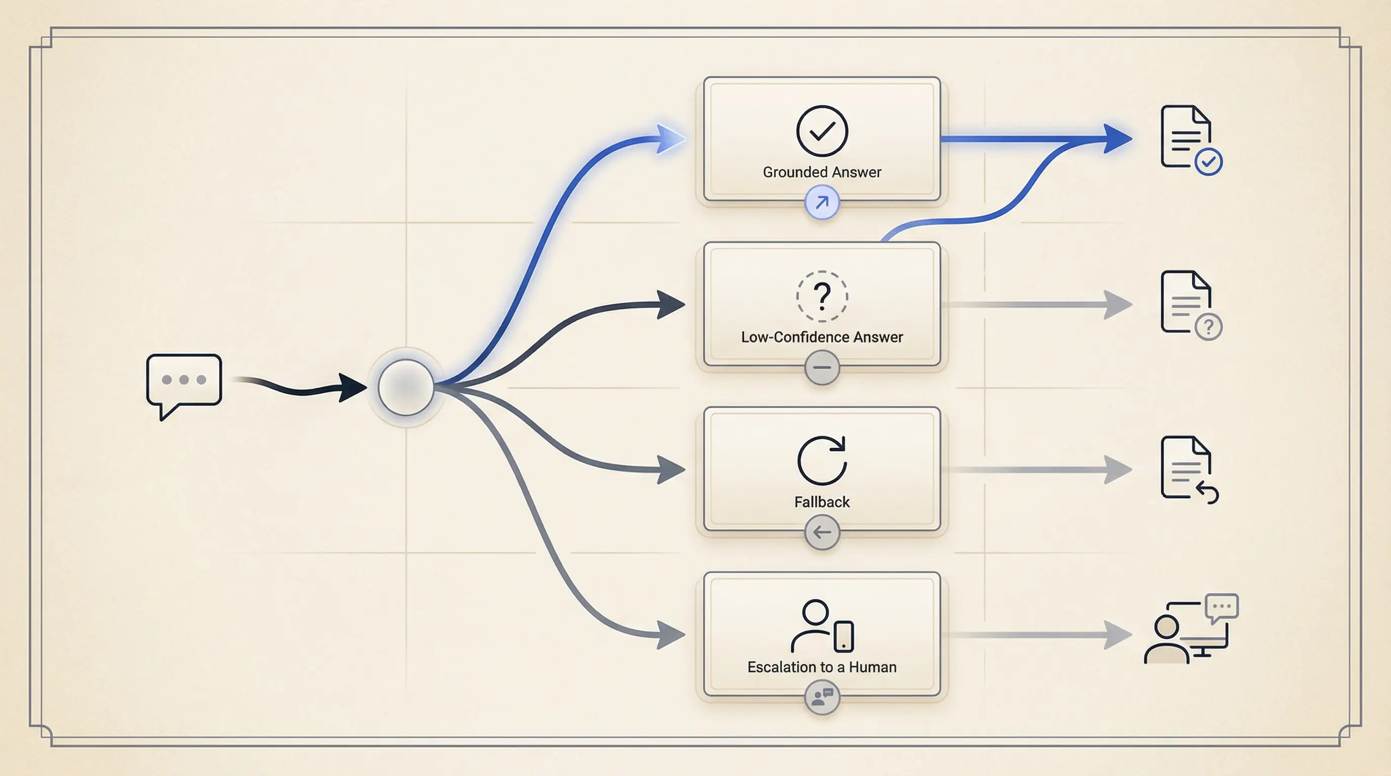
How much should I trust this?
I do not love fake precision badges. But I do want calibrated trust.
That usually means:
- clearer boundaries,
- source visibility,
- explicit low-confidence copy,
- and different presentation for grounded versus weak answers.
What can I do if it is wrong?
This is where many teams still fail.
If the only recovery path is "start over," the feature is not ready. Users need a way to:
- edit constraints,
- choose different sources,
- ask for clarification,
- stop the run,
- retry safely,
- or escalate to a human path.
Microsoft HAX calls this support efficient correction. That is exactly the right phrase.
What is the cost of this action?
This is not just about money. It is also about:
- waiting time,
- private data exposure,
- and whether an action is reversible.
If the user is about to spend credits, send sensitive content, or trigger an expensive workflow, the interface should make that legible before the action fires.
The smallest AI state model I trust before launch
One of the most common implementation mistakes is treating AI UI as a single response box.
In practice, the interface is a state machine.
For most product AI flows, I want at least this level of state clarity:
type AiState =
  | "idle"
  | "clarifying"
  | "confirming"
  | "running"
  | "streaming"
  | "low_confidence"
  | "blocked"
  | "error"
  | "done";

type AiViewModel = {
  state: AiState;
  message?: string;
  sources?: Array<{ label: string; href: string }>;
  actions?: string[];
};
Why these states?
clarifyinghandles vague intent before wasted output,confirminghandles cost or permission boundaries before commitment,streamingreduces dead-air latency,low_confidenceseparates weak evidence from normal completion,blockedcovers entitlement or policy constraints,errormakes recovery honest instead of vague.
This is also where accessibility matters. Streaming text, dynamic updates, and action changes still need keyboard support, focus management, and readable announcements. AI does not get a pass on the WCAG baseline.
What I measure before claiming users trust it
If trust matters, I want some proof that the interface is doing its job.
I care about metrics like:
- low-confidence rate,
- clarification rate,
- cancel rate during long runs,
- correction rate after first answer,
- source-open rate,
- fallback rate,
- and cost per successful task.
These are not perfect trust metrics. They are still much better than "people clicked the feature."
If correction rate is high and source-open rate is near zero, the UI may be hiding important context. If cancel rate spikes during generation, the waiting state may be wrong. If low-confidence output looks visually identical to normal output, the feature will teach over-trust.
That is why I like AI UX work. It sits at the point where product judgment, systems thinking, and user trust meet.
The takeaway
Most AI products do not need a more theatrical interface. They need a more truthful one.
The job of AI UX is not to make the model feel magical. It is to make the system feel legible, steerable, and safe enough to use again.
If you want better adoption, stop asking only whether the model got smarter. Ask whether the interface tells the truth about uncertainty, recovery, cost, and evidence.
That is usually where the real product gap still lives.
Key takeaways
- Users rarely experience model quality directly. They experience uncertainty, latency, cost, and recovery through the interface.
- AI UX is not a polish layer after the model works. It is the control layer that makes AI behavior usable or unsafe.
- Trust grows when the product sets expectations, shows provenance, supports efficient correction, and fails honestly.
- A small state model and a few trust metrics usually matter more than one more prompt tweak.
References
Want this quality level in your product?
I help teams ship AI features that are fast, trustworthy, and production-ready.